
Markets are hard to read even by seasoned practitioners. And there are a thousand tools (of varying complexity) out there to interpret them. What can I offer in the face of this complexity ?
Whenever I looked at the market performance chart, I always struggled to find the simplest lens with which to make sense of the data. And that's what I decided to use for analysis.
Simplicity !
So I don't offer a complex magic formula here.
But it IS magical, if simplicity was what we were after.
Most of the time, the edge (good performance) in the market comes from psychology, rather than choosing the best stocks.
The stock market is a device to transfer money from the impatient to the patient.” — Warren Buffett
And patience is what ? but an emotional/psychological virtue.
Lets briefly touch on ETFs. ETFs are exchange traded funds, which bring together a bunch of stocks, to provide a less volatile growth path for the savings. If you own just one company’s stock, its too risky. Company can go down for any number of reasons. By bunching together a group of high performing companies, an ETF makes it much less volatile and less risky.
A popular tech focused ETF is QQQ. Here is a snapshot of top 10 QQQ holdings.
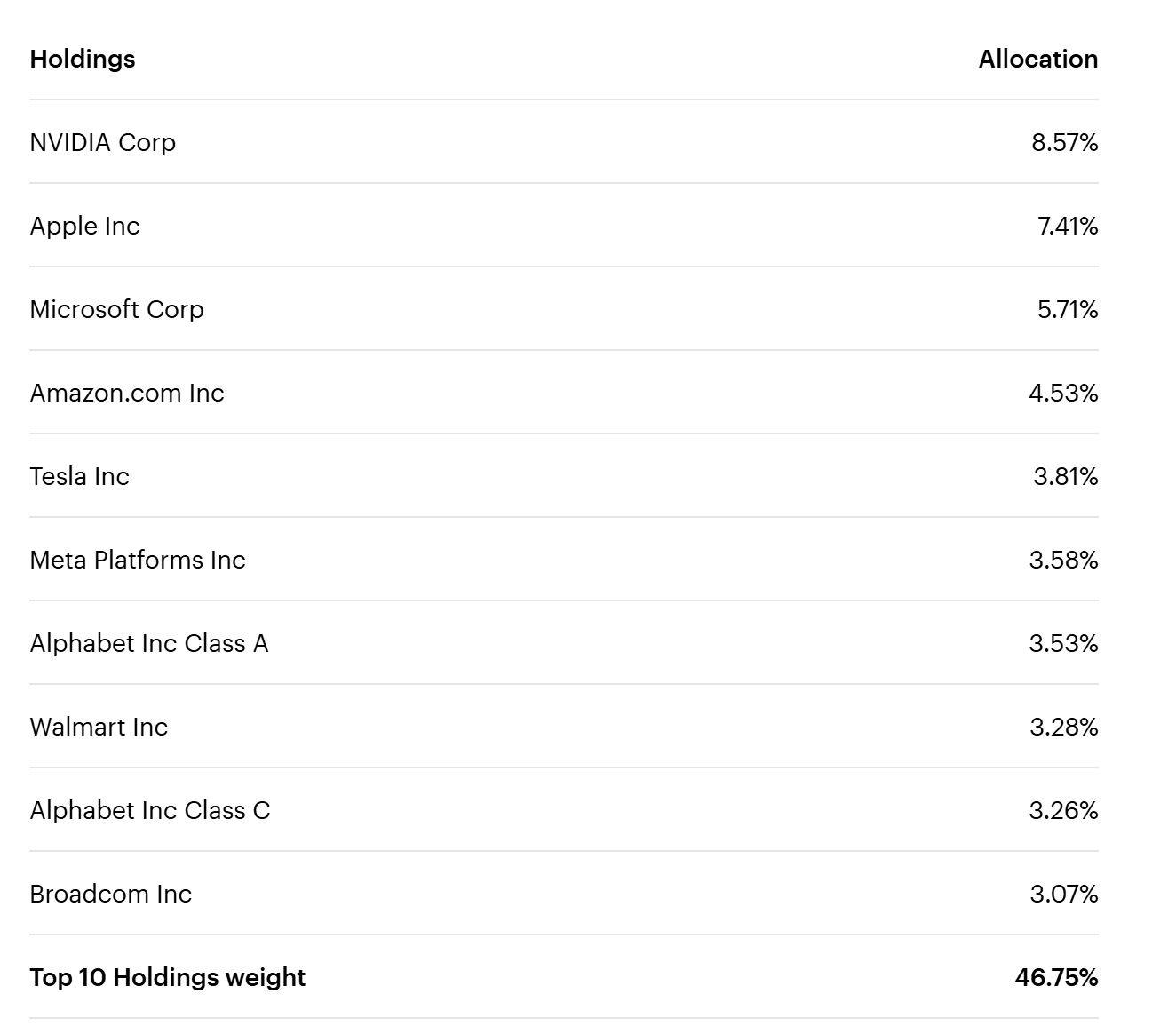
What's striking in there ?
All the big brand names of our era, Nvidia, Apple, Microsoft, dominate the holdings. The top 10 firms by composition account for nearly half (46.75%) of the ETF assets.
That's power law in action : The big gains in the ETF (and the market in general) have come from really a small subset of top players.
If you type QQQ in google finance, or any other charting software, you can be presented with a graph something like this :
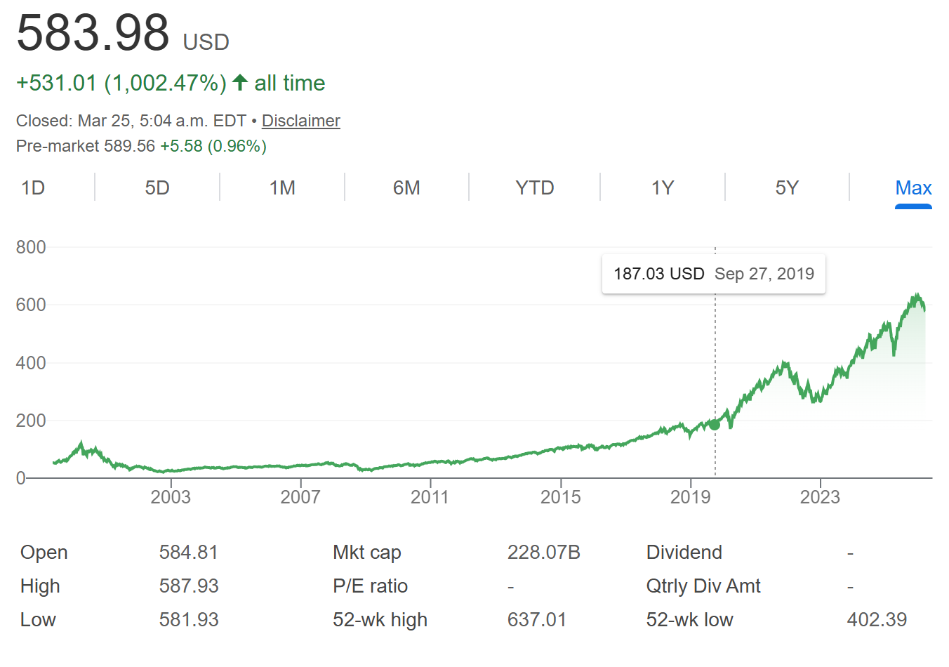
The chart has bumps and valleys, it has periods of slow growth and sudden growth spurts etc. But over 10, 20 years, its hard to read what the graph is saying.
It does have an un-mistakeable up-trend. Tends to go to the right (time) and up (price).
But its hard to filter that trend into a clean expectation, or a model to work with, while thinking of investing your savings.
But if we can somehow zero in on a simple model of the underlying trend, it could be very helpful in building a mental model. The mental model will tell us of how this sector (of the economy) has behaved over the last two decades, and how it might continue to behave.
Starting point
For the start, we can pick up the year 2010. Why 2010 ? Because in 2010 we had just come out of the great financial crisis (GFC)of 2008. The GFC was a kind of reset to the economy, that had become highly leveraged on the back of real-estate. An unsustainably high amount of debt (leverage) has morphed into a financial illness that had spread to all the sectors of the economy. The GFC Reset gives a fresh starting point for the trend. It gives us a good 15 years, to ask the question on how the technology world has evolved since then.
Granularity
How often should we sample the price/value of the ETF. Too often, the daily sampling would be full of noise, and random walk structure of the stocks. Too infrequently, like after a year, hides a lot of structure in the data, and the way markets and sentiments have evolved through time. A lot of happenings and jolts get hidden away. So what's the perfect interval ?
The interval is chosen to be quarterly price closings. A quarter, or 3 months, happens to be an excellent tradeoff for viewing the macro-behavior of the markets. One important reason is that companies report their earnings each quarter. This is new data that market is allowed to capture, interpret and then react too. Everything happening in the geo-politics and economies throughout the world, gets priced into the market through their impact on the companies. This gives us four data points throughout the year. That is 60 data points for the 15 years since the end of GFC. That is a fairly good bunch of data to see if there is a consistent trend to which the data has held.
The Trend
So how do you measure the trend ?
QQQ ETF was sampled at the quarterly intervals, since 2010. And then, the price after each quarter was used to fit an exponential curve to it. Purpose of the curve ? To see a clear statistically unbiased answer to how the sector has performed over the last 15 years.
How does the result look like ? Below is a graph of quarterly prices for QQQ
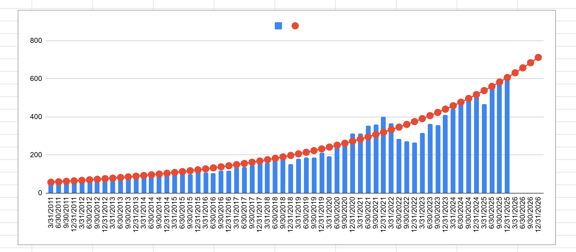
As you can see, starting from 2011, to the last quarter of 2025, the exponential growth trend follows the QQQ closing prices really well.
One simple equation, (of compounding) determines the red line. No fancy moving averages, no 100 day, 200 day, or 50 day decisions to make. Just one simple compound growth curve, to fit the trend.
Below is how the actual money would have performed, if we had invested 10,000 dollars in the ETF at the beginning of 2011.
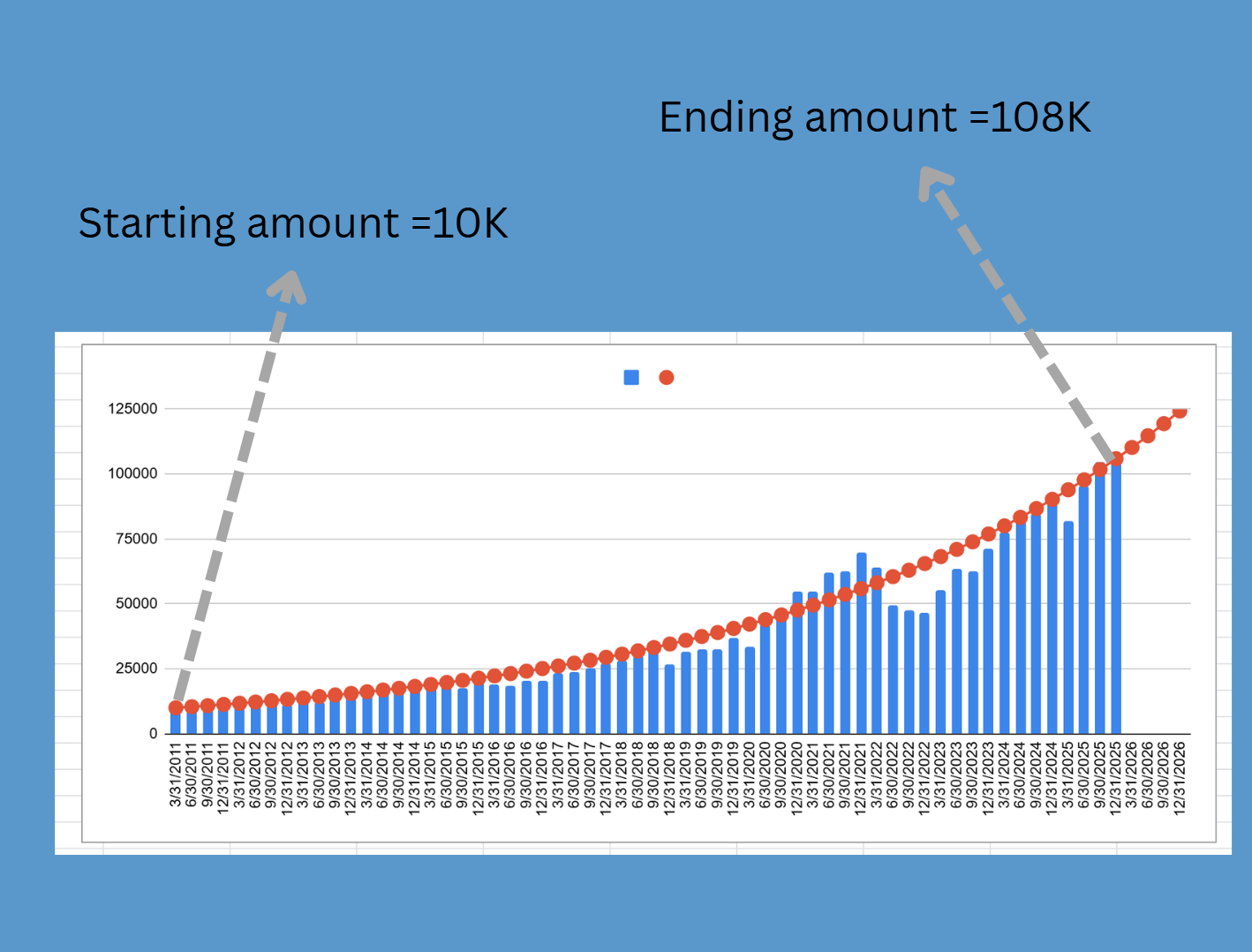
An investment of 10K at the start of the period, would have yielded nearly 10x and grown to 108K by the end quarter of 2025.
The Noise
Now with the trend , we can start looking at points in map which carry noise. Noise in the markets is what kills the long term strategy of staying invested in the market. Here is the superposition of significant noise spikes within the trend.
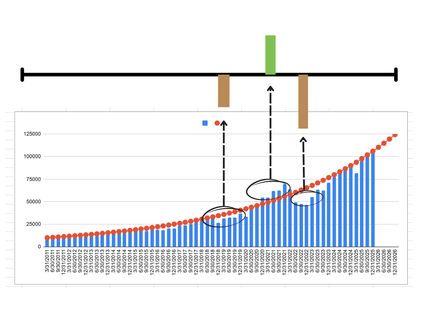
The figure shows 3 points of departure, aka noise, from the trend line.
The first one is a negative noise in 2018. Where the market lagged behind the trend for a while.
Negative noise can really test investor patience. Especially for those who might have started their investing journeys recently.
Then we had a huge positive spike in 2021, post covid, when the artificial stimulus unleashed by the governments worldwide starting running and sloshing in the arteries of the financial system.
Now positive noise, or up deviation from the trend, might sound harmless, or even interesting artifact to be captured, but it is actually equally bad, or even worse, than the negative noise. This is because it is a source of huge psychological pain for the investor who might have gotten used to the abnormally good numbers in the portfolio.
But thats not just the only bad with the negative noise spike. The negative spike is also an opportunity ! An opportunity to deploy any additional capital that is waiting on the sidelines. But because the psychological pain of draw down is so severe, it can completely blind us to deploying any additional capital whatsoever.
Such an opportunity presented itself with the third noise spike of 2022. Where a massive gap opens up between the blue bars and the red line. This was a great time to have loaded up on the cheap-er market prices. Mr. Market was offering us a deal, but it was very difficult to recognize the deal, in that instance.
The opportunity in the noise (only if you have the signal !)
We see that in instances of up noise, one could have skimmed off the profits a little bit. Knowing the market is way past the growth-line.
But way more important, is to hold steadfast during the negative noise spike. Hold yourself from selling off anything. Better still, buy with any additional money rolling in.
But most people aren't able to do that.
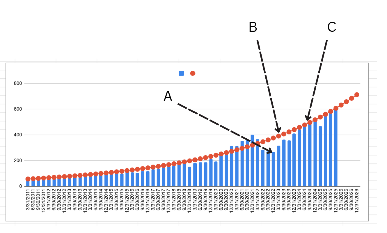
Why ? Because with the falling markets, or flat markets, there is no psychological safe harbor, to tell you that the progress in the world is still happening, still unfolding. When the market is in deep throes of pain (point A in the figure below), the red growth-line (point B) acts as a reminder that the growth is still happening, and human ingenuity is still at work improving things ever so slightly…… until eventually the dark clouds go away, and the market catches up to the historical growth route (point C). During the time, the red line was the line of psychological safety. A reminder of the progress happening underneath the complex chaos of the financial markets.
How do I use the tool
How best to utilize the growth-line shown in the charts above ?
Once a suitable exponential fit is found based on historical data, the compounding rate is fixed. The trendline is then extended beyond the data that is visible to us. This is the ‘extrapolation’ of the trend. The figure shows this extrapolation happening.
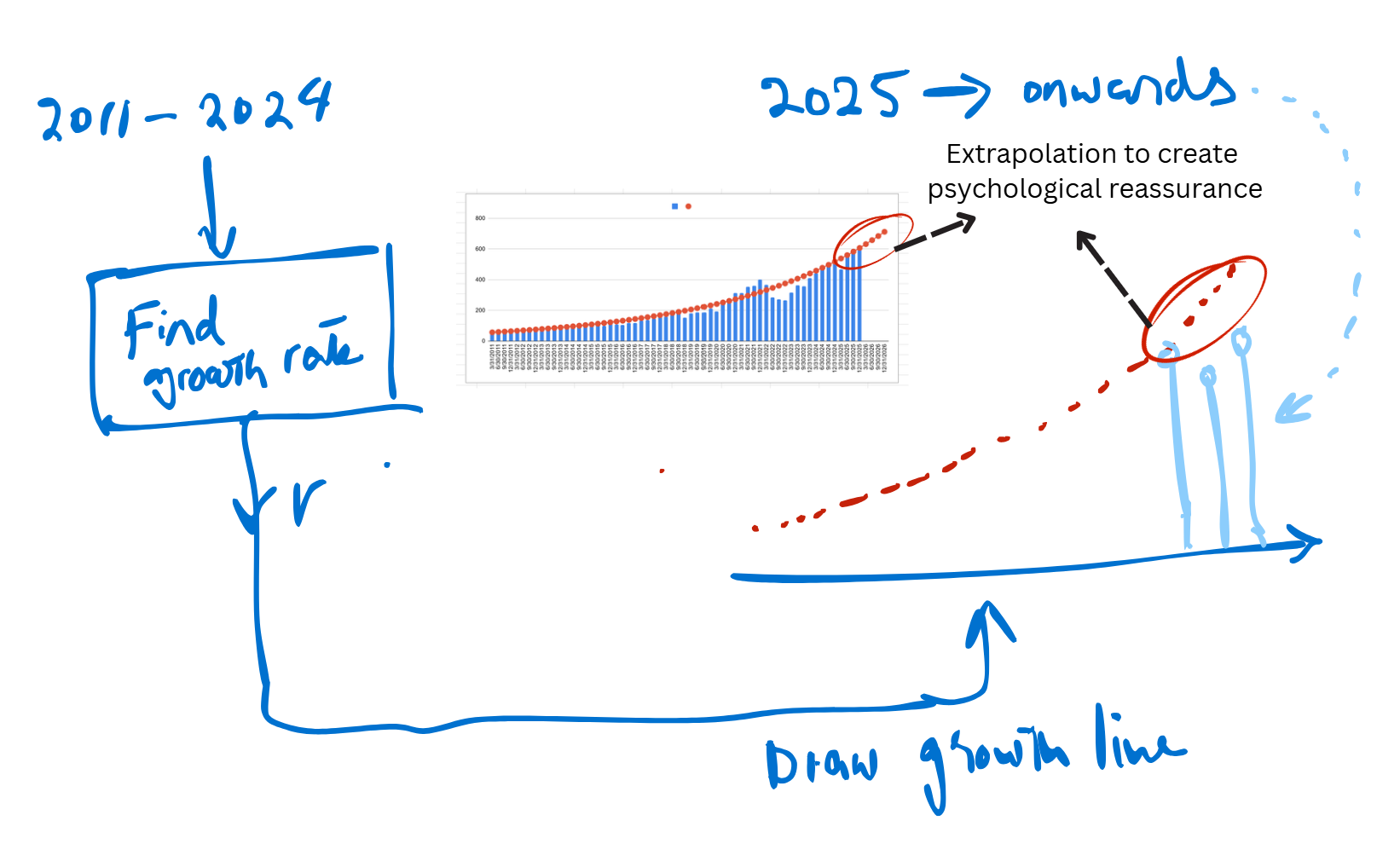
Once the trend line has been drawn using the past couple of years of data, then the trend can be extrapolated, for any number of new quarters. Once the data from the next quarter arrives, it can be benchmarked against the trend, to see how over-valued or undervalued the current market is with respect to the trend.
In the upcoming articles, we will discuss in more detail, what these trend numbers are for some of the big name indices like QQQ, TQQQ, VOO, SPY etc. This allows one to choose the compounding vehicle that would best suit their profit and risk needs, but more importantly, to stick with that vehicle over the long run. Some interesting questions arising are :
- Will this trend continue
- What happens if this trend gets interrupted
- What if I choose my start and end (growth-fitting interval) differently
- What does growth look like if I use a leveraged ETF
- What does growth look like if I use other sectors of economy
Together, we will mull over some of these questions and try to dig through answers by using this lens of compounded growth trajectory.
Please share your thoughts about the analysis, and whether the visualization of growth-line as laid out here, helps with the psychology of investing.