
Sometimes we look at market chart spanning the last three years from today and think:
Why didn’t I just invest that spare $20,000 when prices were at the bottom?
In hindsight, past crashes look obvious. Recoveries look inevitable. Previous years suddenly appear to have been perfect entry points.
The problem is never the lack of judgement or inability to take action or more importantly, even the knowledge of the markets.
The problem almost always is a lack of psychological re-assurance at just the right time.
To address it, I built a simple trend-line model that provides that sharp assurance, by giving perspective on how the market has evolved in the past, and what happens if we just keep extrapolating the trend.
A model is something that helps you think. Not just make predictions, or calculate risk vs opportunity, but to fundamentally help your thinking. A common saying used to describe models is :
All models are wrong, but some are useful.
A model is a miniature. It skips on many details. Why ? Because we value cognitive simplicity. We don’t want to burden our cognitive resources, if not essential. Humans are wired for simplicity. Simplicity makes it easier to take action (or not take action) when needed.
A good model skips details that don’t matter for your context. Here is my context. I am a re-inventing mini-retiree. I am retired for a couple of years, while learning the ropes of entrepreneurship, re-inventing myself while also supporting family. I need a safety net, steady cashflow, and a hands-off posture — I’m investing, so that I can focus elsewhere: on building my business.
Your context might be slightly different. But many elements would still rhyme. The question I am asking is :
“How do I keep a reasonable level of sanity, while being invested in the market, so as not to panic at the market bottom, or become euphoric at the top”
The particular detail that this model focuses on : Where will market likely be in a couple of months time from now. Not days, or hours… but in a couple of months time. Why this granularity ? Briefly: Long term growth trend is much much easier to isolate and study, than short term random fluctuations in the market. More on this later.
What is the fundamental utility of the model ? This model is about giving me a peace of mind. A psychological reassurance that market is on track, and all I am observing is noise around the trend. What this helps with, is to set an operating rhythm. Whenever I need to take a decision on something, I can consult the model.
A side note to psychological peace of mind : This model makes the fear of all-time-market-highs very normal. In the model, the current data point, is always at an all-time-high ! This really normalizes this behavior, and make the psychology impervious (mostly) to doom-sayers and pundits.
Lets talk mechanics
The big part of model mechanics is compounding. The question we are asking is this :
What is the simplest compounding gain, that can explain the market evolution.
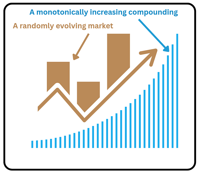
In other words, what happens if we put a straight up compounding curve (at a certain compounding rate) and a chaotic evolution of markets on top of each other. What I wanted to observe was : Can a chaotically, randomly evolving markets, be put on top of a fixed rate compounding curve, and a trend found ? What could be more simpler than that, if we find a signal there. Below is a depiction of two objects we are comparing.
But I don't want compounding at the yearly scale. That is too coarse. Our expenses and money decisions are more of a monthly deal. We pay rent every month. We buy groceries every other week or so. We need our psychological resilience at this scale.
But yearly is too coarse for monthly rent and groceries. Weekly is too stressful — you don’t want to be checking markets on a family vacation. Quarters (3 months) are the natural beat: every three months, every public company reports earnings, and investor reactions drive the cycle.
Real Market Numbers and Graphs
Lets have a look at what happens if we take the above considerations and plug them in to create a model. Our input parameters looks at the SPY ETF, in the post 2008–2010 global financial crisis period. Here is a visualization of input parameters
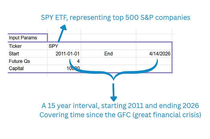
SPY is the most common stock level representation used for US stock market. And the recent 15 year interval contains a lot of normal (and sometimes even extraordinary) gyrations of the market including covid crash, massive inflation, interest rate hikes, Ukraine war, other geopolitical conflicts, and some of the fastest occurring changes in the technology world. What it skips over, is the black swan event of the financial system , namely Global Financial Crisis of 2008–2010. The plot of the SPY ETF is shown below, with a superimposed red curve, that is generated using the math of geometric mean (in other words finding an average growth rate, given all the numbers in blue bars).
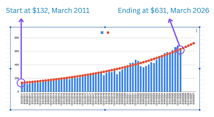
Notice how the ETF, has evolved from its one unit costing $132 to each unit costing $631 over roughly 15 years. That is nearly 5x increase in the value of asset held.
The red line (generated by the tool) indicates the trend. A simple compounding line, that can point to what the next 3 months hold in store, for the growth of the fund.
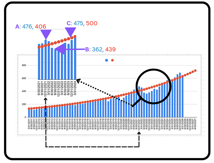
Now lets zoom in on an area/time-zone of the graph, where the psychology of red line would be helpful. Here is an area that we are zooming in on, shown by the black circle. We will observe psychology of investing at three points A, B and C on the curve. The illustrated period is from the ending quarter of 2021, to the beginning of 2024. Encompassing close to 2 years,
Overvalued Regime (A)
Starting off at point A, in the last quarter of 2021, we are in a classic over valued region of the curve. The index is valued at 476, but the superimposed growth curve reads 406. If you are an investor, or a passive ETF holder, what should you be thinking ?
When market is breaching all time highs, one after the other, your job as a passive ETF holder, is not to get anchored to the very peak value reached by the portfolio.
Not to get too much anchored to the flashing number on the portfolio. Lets say, all the portfolio was invested in this one ETF, and the value read, 300,000. This is a fairly decent sized, mini-retirement nest-egg. After point A, there was another quarter of overvaluation, until the market dipped into a down territory, due to the jacking up of interest rates. And then we come to point B in the third quarter of 2022.
Undervalued Regime (B)
At B, just a couple of quarters later, the market has dipped to the value of 362.
ETF Value : 476 — — ->362
Dollar value : 300K — -—>228K
That’s a loss of over 20%. The 300K portfolio, is now showing the number 228K ! You can still mini-retire on that amount, but for a lean mini-retiree, you have lost nearly two years worth of expenses !….
BUT, this is also the point, where psychology needs help. And the help can come from the red-line of growth. At point B, the red reads 439. Far from the loss of more than 20%, we are showing a very modest loss of close to 7% to be on the trend-line. What should a long term investor be thinking ?
That, I am getting a thing worth (very likely) 439, at a discounted price of 362. That is a massive massive markdown on the current (predicted) price. Now the situation begins to look enticing, rather than gloomy. All because we had an anchoring reference. A price point that naturally emerges from the long term compounding rate of the market / economy / sector.
Back on trend ( C )
And finally we reach point C, where the market , after having gone through a full cycle of a over and under the trend, is catching up with the trend. At C the index is about to catch up with the trendline, ready at 475, while the psychological red anchor is sitting at 500. As you can see in the next quarter, the ETF valuation, almost exactly hits the red mark. While the market was going through these up and down swings, the red line keeps providing an emotional check-mark, at all stages of the market dynamics. The best part ? We can extrapolate the anchor for any number of quarters, to get a price estimate of where the ETF might stand then. It provides an easy way to get started with betting on where the market might be, with respect to the current valuation. If you have a new money to put towards investing, this can show you, in a very straightforward way, what kind of gains can be expected out of new money.
How best to leverage the model
The trend line can be easily extended to any number of quarters. But there is two that are particularly important. The current quarter, and the next quarter !! Yes, of course, our present, and the future.
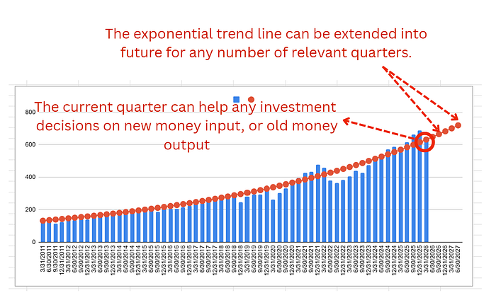
The current quarter, (shown with the red circle) can point us to any immediate decisions. If we have a new money waiting to be deployed, the current quarter can warn us of a big over-valuation in the market, in which case we can wait for a quarter or two. It can also simultaneously warn us of an under-valuation, in which case we can deploy any extra money lying around, in a hurry.
What about the future quarters ? For any strategy involving leverage, the future quarters can inform us of likely payoffs, we can hope to make on our leveraged positions. For example, if I have bought a call option to bet on market going up, I can evaluate the expected profit on that option, based on the time to expiration, and relating it to the nearest future quarter.
So what does it say about growth ?
And finally, what does the model actually say about growth. The rate at which the line in red is progressing.
i-e once I have fit the exponential compounding curve on the SPY (or S&P 500 index), what does it inform me about the growth rate experienced by the market. Here are the key numbers returned by the curve.
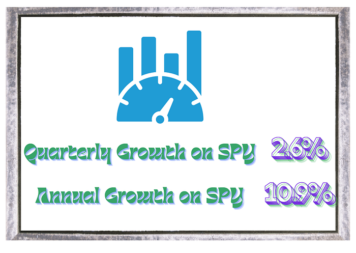
The quarterly growth rate was 2.6%. Quarter after quarter, our money should grow at this rate. When you convert it into the yearly growth rate, it comes out to be 10.9%. You might wonder and ask, what is so special about that. Even a simple google search reveals the stock market returns 10% a year historically.
And you would be right to pose that question.
But for me, the annual growth number, even if the same as historically implied, the model still provides four very useful things :
- Validation — it confirms what the finance books argue, but in your numbers (and your sector of market), not someone else’s aggregate
- A quarterly yardstick — not a once-a-year guess, but a check-in four times a year (to match investment of new savings or withdrawls)
- Visual conviction — a trend you can actually see, which builds trust in a way a single number never does
- A feel for the noise — you start to understand, viscerally, how much variation is normal, which means you’re far less likely to panic when the wobbles come
Using the quantitative yard stick, helps me to keep my emotions in check, throughout many events that are happening during the year. The wars, the tariffs, the geopolitical battles, etc. Nothing can get you carried away, with that red trendline calmly plotting its course in the background.
If you can stay the course in investing, that really helps your returns. If you can keep emotions in check, and invest new savings into the market, at points of psychological discomfort, you can add a remarkable bit of oomph to your gains.
Final Thought
Markets will always find new ways to scare people.
Wars, inflation, recessions, elections, bubbles, crashes, tariffs, technological disruption — there is never a shortage of reasons to panic.
But beneath all of it, productive assets have a long history of compounding upward.
Sometimes the smartest investing tool is not a forecast.
It is a steady line that reminds you what noise has looked like before, and what it might be looking like, right now.